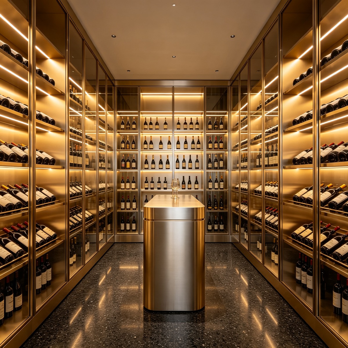
PVD colors give stainless steel and other compatible metal surfaces a more considered finish than standard mill or brushed metal. Gold, rose gold, bronze, black, and champagne can each create a different mood, but choosing between them is not simply a matter of picking a color from a screen. The final appearance depends on the base metal, surface preparation, coating process, gloss, viewing light, surrounding materials, and how the part is formed and installed.
That is why a physical sample matters. A warm champagne finish beside cool glass may look different from the same sample beside stone or timber. Black can appear soft and understated in a satin texture, or highly graphic in a reflective finish. Bronze may read as brown, copper, or smoky grey depending on the lighting. This PVD colors guide explains the practical differences between the five finishes, where they are commonly used, and how to specify them without making promises that a sample or generic color name cannot support.
What Are PVD Colors?
PVD means physical vapor deposition, a vacuum-based surface treatment that deposits a thin coating onto a prepared substrate. In architectural work, the process is often used on stainless steel components such as wall panels, trims, elevator interiors, door details, screens, handrails, ceilings, furniture parts, and feature elements. The coating is not a thick layer of paint, and a PVD color name is not a universal standard shared by every fabricator.
The substrate and preparation remain visible through the final result. A brushed base, mirror-polished base, bead-blasted surface, or textured surface can produce different reflections under the same coating family. Forming, welding, grinding, and cutting also need to be planned because the finished appearance must continue across edges, returns, joints, and visible fabrication areas.
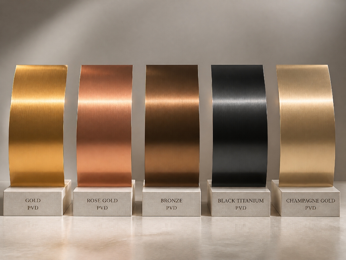
Gold PVD
Gold PVD is often selected when a project needs warmth, visual emphasis, or a hospitality-led sense of detail. It can work on feature walls, elevator interiors, reception elements, trims, screens, door hardware, furniture accents, and branded spaces. Gold is not one fixed appearance: pale champagne-gold, classic yellow-gold, and deeper antique-looking tones can all be described informally as gold.
The surrounding palette matters. Gold can sit comfortably with stone, dark timber, neutral paint, glass, and warm lighting, but a strong yellow tone may dominate a small room. On a large wall or ceiling, a satin or brushed texture can be easier to control than a highly reflective surface. Confirm how the supplier defines the selected color and whether the same finish can be repeated across batches. If gold is being used on a large elevation, review the panel joints and viewing distance as well as the color itself. A finish that looks elegant on a small trim may feel much stronger when repeated across a wall, lift interior, or ceiling. Asking for a larger sample early is usually less costly than revising a finished installation.
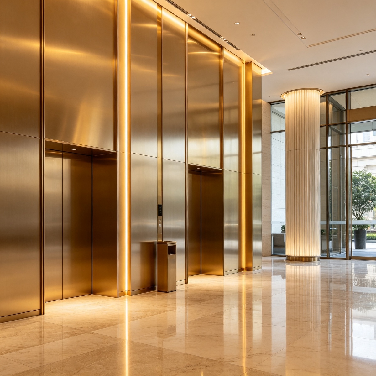
Rose Gold PVD
Rose gold brings a softer pink or copper warmth to metalwork. It is commonly considered for hotels, restaurants, retail interiors, vanity areas, reception counters, feature partitions, and residential-style commercial spaces. Its character can shift noticeably with lighting: warm light may make it look more copper, while cool light can emphasize the pink or muted metallic quality.
Rose gold usually needs careful coordination with adjacent colors. Pairing it with pale stone, off-white surfaces, grey, glass, or timber can produce a restrained result. If too many warm materials are placed together, the space may feel visually heavy. A sample should be viewed alongside the actual stone, tile, laminate, glass, or paint rather than approved in isolation. Also look at the proposed finish from the approach path and at the height where people will see or touch it. That practical check often reveals whether the pink undertone feels intentional, whether reflections are distracting, or whether the selected texture suits the scale of the room.
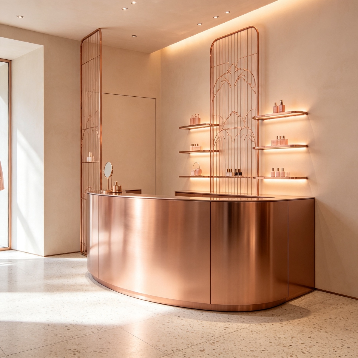
Bronze PVD
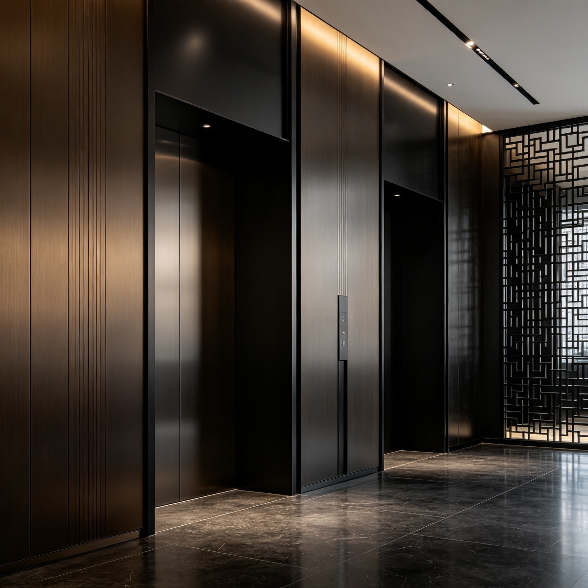
Bronze PVD is a useful middle ground when gold feels too bright and black feels too severe. It can add depth to wall panels, elevator surrounds, screens, handrails, cabinetry details, and hospitality interiors. Depending on the base texture and light, bronze may appear brown, copper, smoky, or slightly grey.
Bronze is often forgiving in busy interiors because its deeper tone can sit between light and dark finishes. That does not mean it hides every mark. Fingerprints, cleaner residue, scratches, and inconsistent grain direction may still be visible, especially on smooth or reflective surfaces. Specify the texture and cleaning method together, and inspect a sample after the proposed fabrication process rather than approving only a flat color chip. This is especially useful when bronze is combined with brushed stainless steel, dark paint, or natural stone, because the surrounding surfaces can make a small undertone difference more noticeable than expected. Record the approved grain direction as well as the color reference.
Black PVD
Black PVD is chosen for contrast, a sharper architectural line, or a modern industrial mood. It can define door frames, lift interiors, screens, trims, handles, feature ceilings, and dark furniture details. A satin black often feels quieter than a mirror black, while a directional brushed texture can reveal the grain and make long surfaces easier to read.
Black requires realistic expectations about cleaning and handling. Dust, fingerprints, construction residue, and scratches can stand out against a dark surface. Protection during transport and installation is especially important. The specification should state whether the desired result is uniform black, black with visible grain, or a reflective dark finish. Those descriptions are not interchangeable. Before approving black for a large or frequently touched area, ask how fingerprints, protective film, joint shadow, and local repairs will be handled. A dark finish can be very effective when its edges and neighboring materials are controlled, but it deserves a more deliberate maintenance discussion than a simple color selection.
Champagne PVD
Champagne PVD is lighter and more neutral than many gold finishes. It can add warmth without becoming the dominant feature, which makes it suitable for corridors, lift lobbies, hotel rooms, retail displays, wall trims, and coordinated hardware. Champagne often works well with beige stone, warm grey, light timber, glass, and soft lighting.
Because champagne sits close to several neutral metallic tones, sample comparison is essential. Two suppliers may use the same word for finishes with different undertones or gloss levels. Ask for a physical reference with the proposed base texture and review it in daylight and artificial light. If multiple fabricators are involved, identify the approved sample, coating reference, texture, and acceptable variation before production.
How to Specify PVD Colors Properly
A good specification does more than say “gold finish.” It should identify the substrate, surface preparation, coating family or reference, texture, gloss intention, visible faces, edge treatment, fabrication method, sample approval process, cleaning limits, and replacement expectations. If the finish is visible on folded returns or internal edges, show that in the drawing.
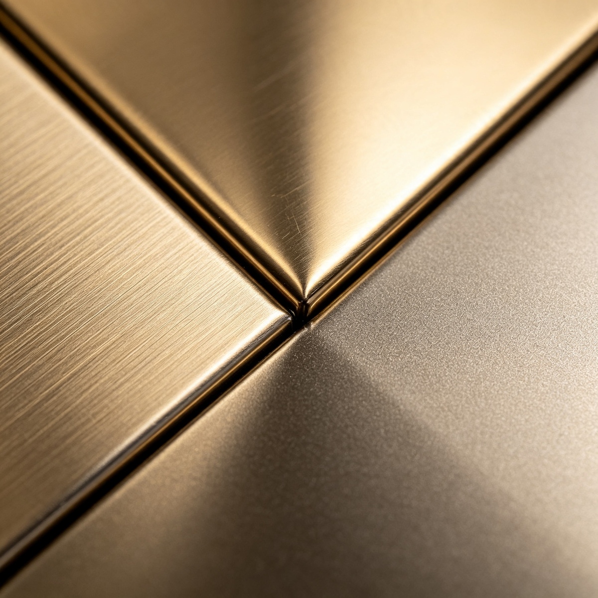
Ask for a sample large enough to judge the real design. A small chip can help with color direction, but it cannot show the effect of a long brushed grain, a welded corner, a folded return, or a joint between two panels. For a high-visibility area, a corner sample or mock-up is usually more informative than a collection of tiny color cards.
Also define how variations will be handled. PVD finishes can show differences caused by substrate, orientation, production batch, lighting, and viewing angle. The project team should agree on the approved reference and the process for reviewing a replacement or additional batch. This is especially important when a project uses panels, trims, screens, and hardware from different orders.
Durability, Cleaning, and Maintenance
PVD is valued for its architectural appearance and resistance characteristics, but no finish is immune to damage. Performance depends on the substrate, coating, environment, installation, contact, cleaning chemicals, and exposure to abrasion. Exterior or high-contact applications need a finish review that reflects their actual conditions rather than relying on an interior sample.
Use a soft cloth or sponge and an approved cleaner. Avoid abrasive pads, unknown solvents, harsh acids, and chemicals that are not permitted by the finish guidance. Wipe brushed surfaces in the grain direction. Remove fingerprints, adhesive, grout, salt, or construction residue using an approved method instead of aggressive polishing. During installation, keep protective film or other protection in place as long as it can be removed without leaving adhesive or damaging the coating.
Record the finish reference, sample approval, cleaning instructions, panel marks, and supplier contact at handover. If a part is damaged, identify the original substrate, texture, color reference, and fabrication direction before ordering a replacement. A replacement that is technically the same color can still look wrong if its grain, gloss, or neighboring finish does not match.
Choosing a PVD Finish for a Project
The best PVD colors choice is the one that supports the space rather than competing with it. Gold and rose gold are expressive and warm. Bronze adds depth without the same brightness. Black creates definition and contrast. Champagne is often a quieter metallic option. The right decision depends on the room scale, natural light, artificial lighting, adjacent materials, touch frequency, cleaning plan, and the amount of finish repetition across the project. It is also worth asking where the finish will be seen most often: a handrail and lift door deserve a different practical review from a high wall panel that is rarely touched. That distinction can influence texture, gloss, protection, and the spare-parts plan.
Before placing an order, compare the physical sample with the actual stone, timber, glass, paint, lighting, and surrounding metalwork. Confirm visible faces, corners, seams, protection, cleaning, acceptable variation, and replacement information. Ask the fabricator to state what is included in the finish price, how samples are approved, and how later batches will be matched.
FAQ: PVD Colors
Which PVD color is most popular?
There is no universal best color. Gold, rose gold, bronze, black, and champagne serve different visual and project needs. The right choice depends on the palette, lighting, scale, contact, and maintenance conditions.
Are all gold or champagne PVD finishes the same?
No. Color names are not always standardized between suppliers. Base metal, surface texture, gloss, coating process, batch, and lighting can change the appearance. Approve a physical sample.
Can PVD colors be used on different metal products in one project?
They can be coordinated across compatible products, but the substrate, surface preparation, fabrication, and batch should be reviewed. A sample should include the actual product type and visible detail.
How should PVD surfaces be cleaned?
Follow the approved finish instructions. Use soft tools and a suitable cleaner, avoid abrasives and unapproved chemicals, and wipe brushed surfaces with the grain.
What should be included in a PVD finish quotation?
Request the substrate, thickness, surface preparation, color reference, texture, gloss, visible faces, sample process, fabrication, protection, packing, cleaning guidance, and replacement support.
结论
PVD colors give architectural metal a wider design vocabulary, but the color name is only the beginning of a reliable specification. Gold, rose gold, bronze, black, and champagne can all work well when the base metal, texture, lighting, surrounding materials, fabrication, and maintenance plan are considered together. Use physical samples, document the approved reference, and review corners and joints instead of judging a finish from a digital image alone. With that discipline, PVD colors can remain a convincing part of a project long after the sample approval and installation are complete. The final handover should leave the owner with the approved sample, finish reference, care instructions, visible-face notes, and a practical route for matching future replacements. That small amount of documentation protects the design intent when the original fabricator or installation team is no longer involved. It also gives the facilities team something more reliable than a remembered color name when a panel, trim, door detail, or screen needs to be repaired or reordered.